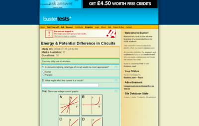
A Little Bit of a Redesign “0”When websites change it is almost always good. I am confident that the changes I have made to the design and layout of busterTests.co.uk are an improvement which will make the site easier to use. Essentially I have moved the menu which was on the right up to the top (into a horizontal form). I have also made everything a bit plainer and nicer to look at. There are less containers of text now, which gives the pages a more open feel to them. The headers have also been revamped into stylish bevelled things, and the sidebar has had a considerable make-over. Also, links now go orange when you 'hover' your mouse over them, which gives a really nice and energetic feel to the pages. On the technical side, however, there have been two changes: firstly the mark-up (the code) has been made cleaner and simpler, which enables search engines and disabled people to use the site better. Secondly, on observation of what Google (the most desirable search engine to target) has actually indexed, I have changed the way users access the tests. The process involves two pages, and is probably less database-intensive. It also should also Google (and co.) to index the tests, which will hopefully make it think the site is bigger, more information-rich and so a better candidate for a higher ranking. But we will see… The battle for a high Google ranking continues… 0 Comments ~ Post a Comment |


